Loomwork · № 004
Open it. Here's what's actually live.
·5 min·Loomwork
Vamshi Krishna V.
Patient work, woven in public.
This is Thread 04 of Loomwork. New here? Thread 01 explains why this newsletter exists — 2 minutes.
The last three threads were about what Foundry isn't, what almost was, and how I picked the smallest version. This one is about the smallest version itself.
It's live. The URL is real. You can open it now: foundry.mindloomhq.com
I'd rather you click that link than read the rest of this. But if you want a guided tour first — what to look for, what's deliberately missing, what's broken — here it is.
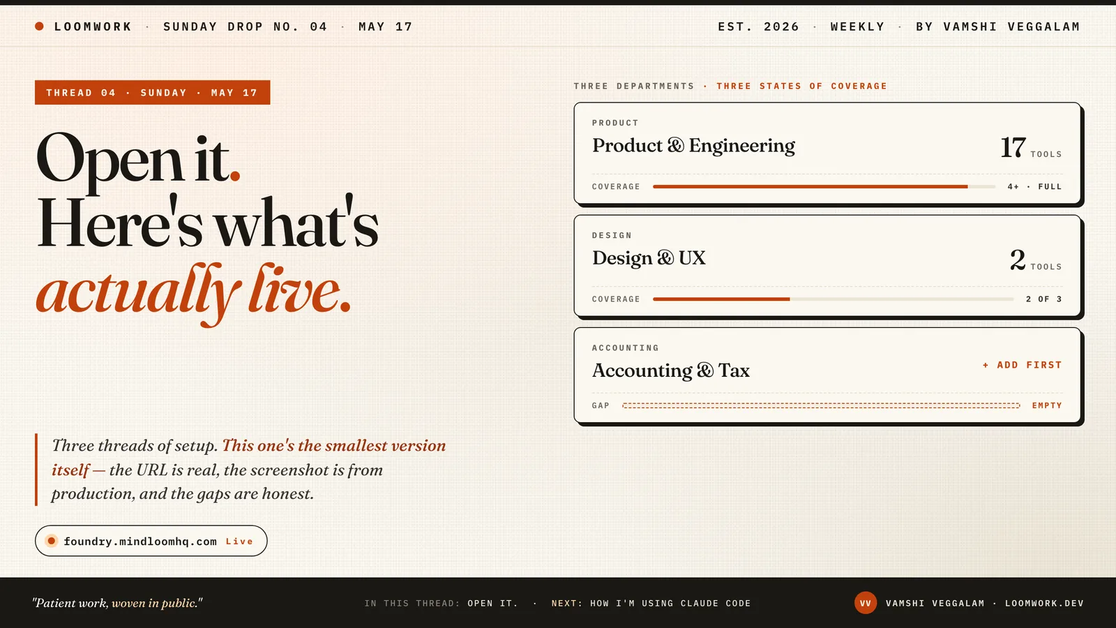
That's what you'll see when it loads. Fourteen departments down the page. The ones with tool counts are tracked; the ones saying '+ Add first' are gaps. The "Accounting" row is empty on purpose — I haven't added any accounting tools yet. Foundry shows you that honestly, instead of hiding the gap.
Click any department, and you get the tools inside it: a launcher pad, basically. Click a tool, you go to its dashboard. That's the whole product.
There are 142 tools in the catalog right now. Fourteen departments are defined. The whole thing fits in localStorage — your stack lives in your browser, not in some database I have to maintain.
The stack underneath, briefly.
Next.js 15 with the App Router. Tailwind v4 for styling, shadcn/ui for components. Deployed on Vercel. Storage is localStorage — no auth, no database, no per-user infrastructure to run.
That last choice deserves a sentence. The obvious move would have been Supabase auth + Postgres from day one — accounts, sync across devices, all the fixings. I'd have spent two weekends on that and shipped nothing visible. Instead: localStorage now, Supabase later when there's an actual user who wants their stack on a second device. The constraint is doing real work — it's choosing the smallest piece that solves the actual problem, instead of the smallest piece that looks like a real product.
When the time comes to add auth, I'll narrate that decision properly. For now: every reader who opens Foundry has their own private stack, in their own browser, with no friction. That's the point.
What's deliberately not there.
I'm building a launcher first because that's what I'd open Monday morning. The rest is what I'd open later, after the launcher earned the right to be deeper.
No AI features yet. No notifications. No data sync. No insights. No "your stack is X% optimized" gamification. No team accounts. No Stripe integration. No mobile app. No browser extension.
These aren't on a roadmap I haven't gotten to. They're decisions I've already made. Each one has a thread coming for why it's not here yet, and what would have to be true for it to ship.
The thing the launcher is for is being the substrate the rest sits on top of. You can't build a useful agent over your stack until you have a stack indexed. You can't recommend tool changes until you know what's there. So: the catalog comes first. The agents come after, on prepared ground.
The mobile thing — and why I'm telling you.
If you opened Foundry on your phone before Friday, the experience was rough. The bug had been open for weeks. I'd shipped fixes; each time I told myself I'd caught it; each time I opened the site on my iPhone and watched it hang.
Friday I took it apart. It was three different bugs wearing the same costume — and I only found each one by tripping over the next.
First: Foundry's layout had body holding the scroll — the pattern Linear uses on the surface. On iOS Safari that pattern interacts badly with the cleanup Radix Dialog runs when a modal closes, leaving body in a state where touch events stop reaching buttons. Moving scroll off body onto a dedicated div fixed the hang and is closer to what Linear actually does under the hood.
Second: the refactor exposed a one-liner I'd written for the paper-grain background that had been silently overriding modals' "fixed position, z-index 50" — because Tailwind v4 puts utilities inside a CSS layer, and per spec, unlayered rules always win over layered ones regardless of specificity. The bug had been latent until the scroll-container change rearranged body's layout enough to expose it.
Third: that fix exposed a viewport-units trap. The onboarding's Review step was capped at "100% of viewport height" — and on iOS Safari with the URL bar showing, that's not the visible area; it's what the viewport would be if Safari's chrome collapsed. About 130 pixels too tall, so the footer with the "Add tools" button sat behind Safari's own UI.
Three small fixes. The change that actually ends the loop is structural: a static check now runs against every modal and dialog file in the codebase and fails the build if anyone writes a viewport unit that doesn't adapt on mobile. The next instance of this class of bug cannot silently reach production. Not "be more careful." Make the careless version impossible.
Shipped Friday, verified on a real iPhone. Mobile and desktop are now the same surface.
What I want from you, if you're feeling generous.
Open it on desktop or mobile. Click around. Notice what's confusing. Tell me one thing — by reply or DM or comment — that didn't make sense, that you wanted to do and couldn't, or that surprised you. I'm reading every one. That's how the next version gets better than this one.
You don't owe me feedback. But the people who do send it are the ones whose use I'm building toward. So: I appreciate it.
Next Sunday: How I'm using Claude Code to build this. The five-file handoff system that means I haven't written this code by hand. What it costs per week. Why the protocol matters more than the model. If you've wondered what serious AI-assisted development looks like in 2026, that's the one.
See you then.
— Vamshi
Loomwork is by Vamshi Krishna Veggalam. Building Foundry at mindloomhq.com, with the full archive at loomwork.dev. Find me on LinkedIn.
This thread first ran on LinkedIn on May 17, 2026 — the conversation is over there. Read it on LinkedIn and join the thread